Read Your Veggies

Content Strategy | Homepage Redesign | Product Scoping

Read Your Veggies is a responsive website that encourages users to have a more balanced media diet by showing them what news outlets on the “other side” of the political spectrum are publishing.

Read-Your-Veggies Home Preview

Overview

The “Read Your Veggies” site shows liberals news articles from conservative publishers, and vice versa. I consulted with the site’s software developers and assisted in the site’s homepage redesign. The redesign is live as of July 2018.

  • DELIVERABLES: Mid-fidelity wireframes
  • TEAM: Alex Orlov, Philip Gonzalez, Scott McCreary, Ian TK
  • MY ROLE: Facilitator, content strategist, UX designer
  • METHODS: Whiteboarding, design studios, Sketch

Problem

How might we create an experience to encourage a user to click and read an article instead of simply scrolling past newsfeed-style headlines on the homepage?

Solution

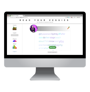
A homepage that displays one article at a time, with the article preview showing a word cloud (aka text cloud or tag cloud) for an article instead of a headline.

Phase 1: Stakeholder Meeting & Ideation

Goals

The stakeholders (a small team of software developers) wanted to streamline the homepage, entice users to click on articles they wouldn’t normally read, and give the site’s copy a more lighthearted tone. The developers were on a tight deadline and needed an actionable solution that would involve minimal engineering.

The Approach

In a brainstorming session I facilitated with the stakeholders, I guided the team towards thinking about defining their ideal user and the value proposition of Read Your Veggies.


Initial Insights

Headlines can give away a publisher’s political stance.

Displaying headlines with sensational language (for example: “The G.O.P.’s War on the Poor “) might indicate to a user that the article comes from a publisher with a certain political stance. Our team hypothesized that a reader might click an article with a headline that aligns with their beliefs rather than click on and consume an article with a different viewpoint.

Newsfeeds discourage deliberate media consumption.

The existing Read-Your-Veggies homepage had a 4x5 matrix showing article headlines and image thumbnails. We hypothesized that since this newsfeed was similar to Twitter and Facebook, social media platforms where users skim headlines and have hot takes on headlines and not the article content, this newsfeed style would not encourage the desired user behavior.
Phase 2: Design Studio & Rapid Wireframing

Goals

We needed to find a way to give users enough information about an article’s topic to want to click on it. And we needed to pivot away from a newsfeed homepage.

Method

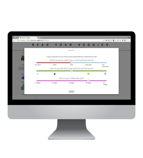
I encouraged the team lean into their idea that media is consumed and that a media diet is balanced. We decided to change the site design to look more like a food logging tool than a breaking news website.

Next Steps

Extending this project beyond the initial ideation, I’d dive into the following:

  • Perform usability tests on the product

  • Build out a more robust onboarding to help users understand what a “veggie” is

  • Enhance user profiles

  • Ideate additional ways to “gamify” the site