PHASE ONE
RESEARCH
At the onset of the project, the team tested the existing PurpleThrone app with three participants who had experience streaming music videos with other apps.
Bey, the entrepreneur and founder, had built and coded PurpleThrone himself. The existing app allowed users to stream music videos and “like” or “skip” them via a swiping mechanism akin to Tinder.
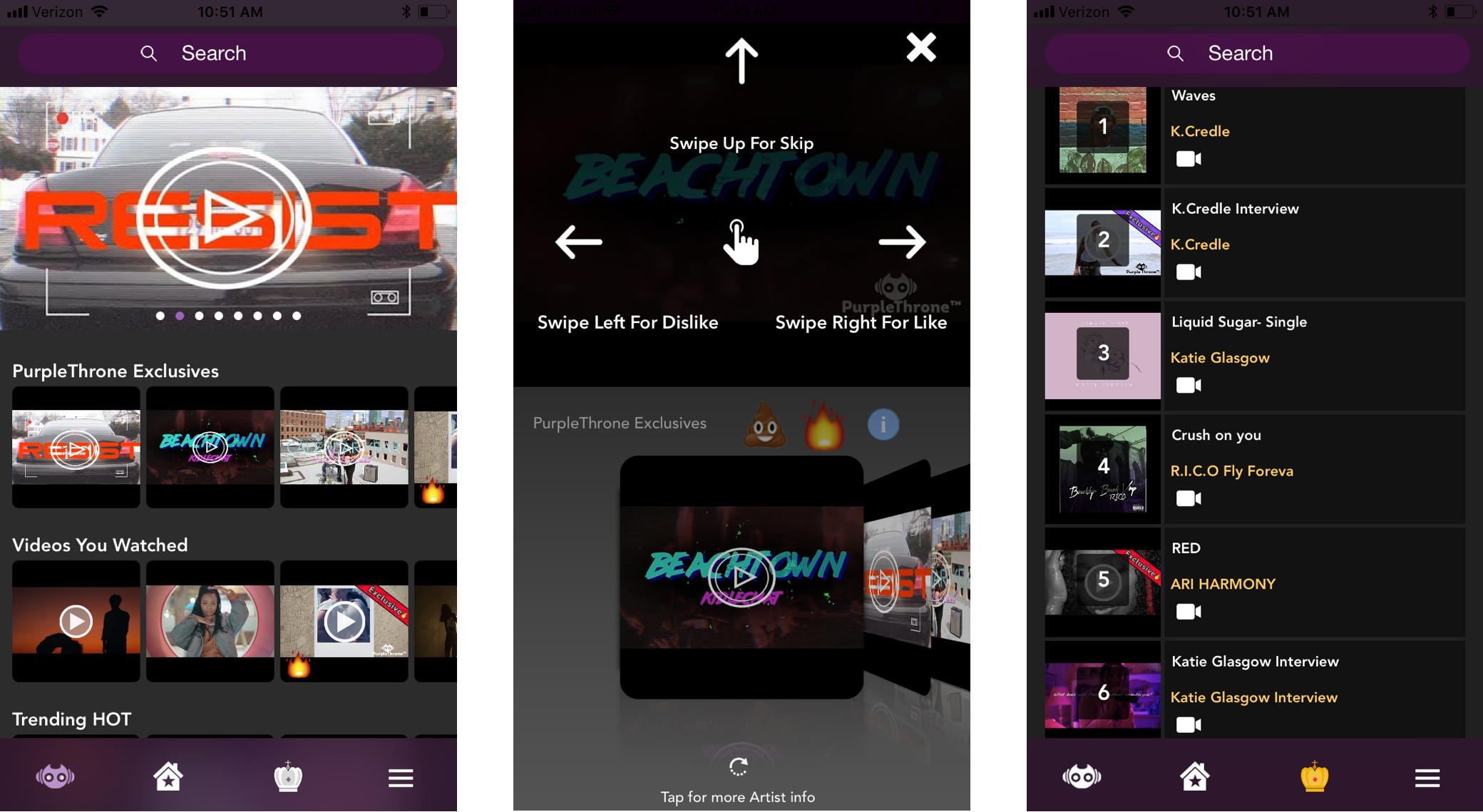
From left to right: Home screen, video viewer, leaderboard screen.
EARLY INSIGHTS
NO LOVE FOR EMOJIS
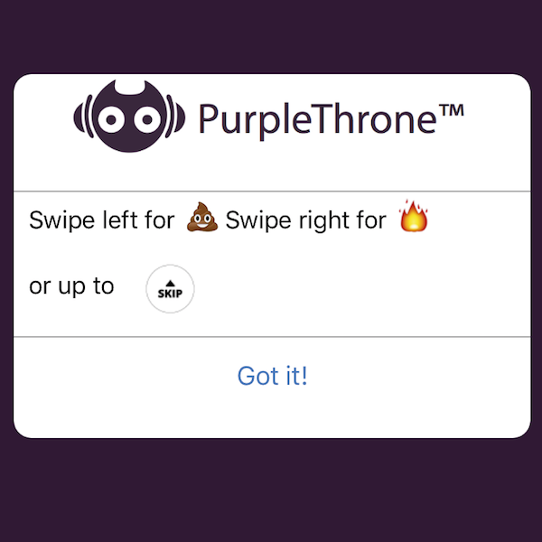
A majority of users didn’t like the poop and fire emojis—and they felt “bad” being negative towards an artist who had put time and effort into their music.
UNEXPECTED INTERACTIONS
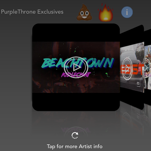
Users expected to be able to browse through the album covers shown on the bottom of the video viewer screen. They were confused when the screen showed additional info on the current song playing.
MISLEADING ONBOARDING
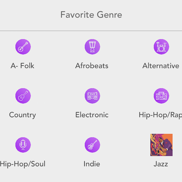
The onboarding asks users their favorite genres — and users expected a homepage that would be personalized to their tastes. They felt misled.
NEXT STEPS
DEEPER INSIGHTS
PurpleThrone is geared towards music influencers who crave new sounds. We disseminated a survey to collect data and also find people who are obsessed with finding the next great thing in music.
Over 100 people responded to our survey.
95%
listen to music on a smartphone
50%
care about listening to independent artists
29%
find new music through music videos
We then conducted seven interviews. Digging into the interview transcripts revealed some big insights around music streaming and tipping.
INFLUENCERS IGNORE LEADERBOARDS
People who are obsessed with knowing fresh music want to know about artists before they make it big.
KNOW MY TASTE
People expect music streaming services to know them and serve personalized music recommendations.
DELIGHTFUL LOOPS
Curiosity motivates people to obsessively click around apps — discovering musicians, tracks, playlists and more. This enjoyable feedback loop keeps them engaged.
CRYPTO WHAT?
Our target users weren’t active in the cryptocurrency community.
PHASE TWO
SCOPE PROJECT & FRAME THE PROBLEM
Given that crypto was not well understood by the target users, the team focused our design efforts on a tip feature that accepts US dollars. Users couldn't navigate the current PurpleThrone UI successfully, and they weren't engaged or connected to the content.
The team created the following problem statement to serve as a central focus.
"How might we help music fans discover new talent they want to support and keep them engaged in their music discovery process?"
NEXT STEPS
UNDERSTANDING THE USER
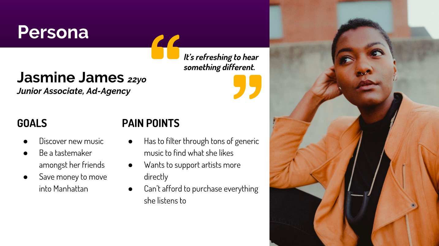
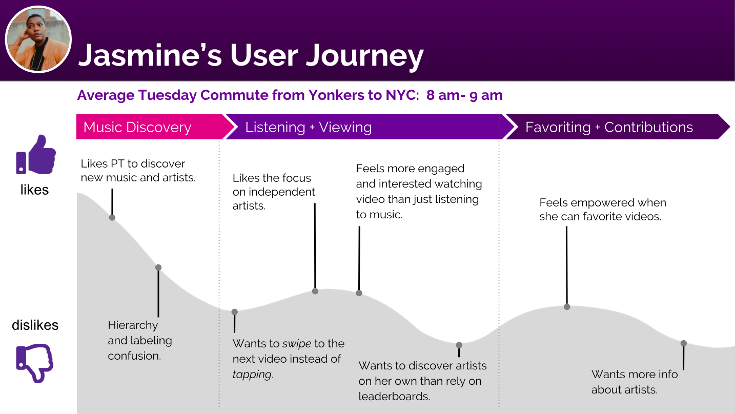
To better understand the opportunity areas, we created a persona and journey map that reflected our early research and user interviews.
[For a more detailed look at our persona, please click here.]
PHASE THREE
DESIGN & USABILITY TESTING
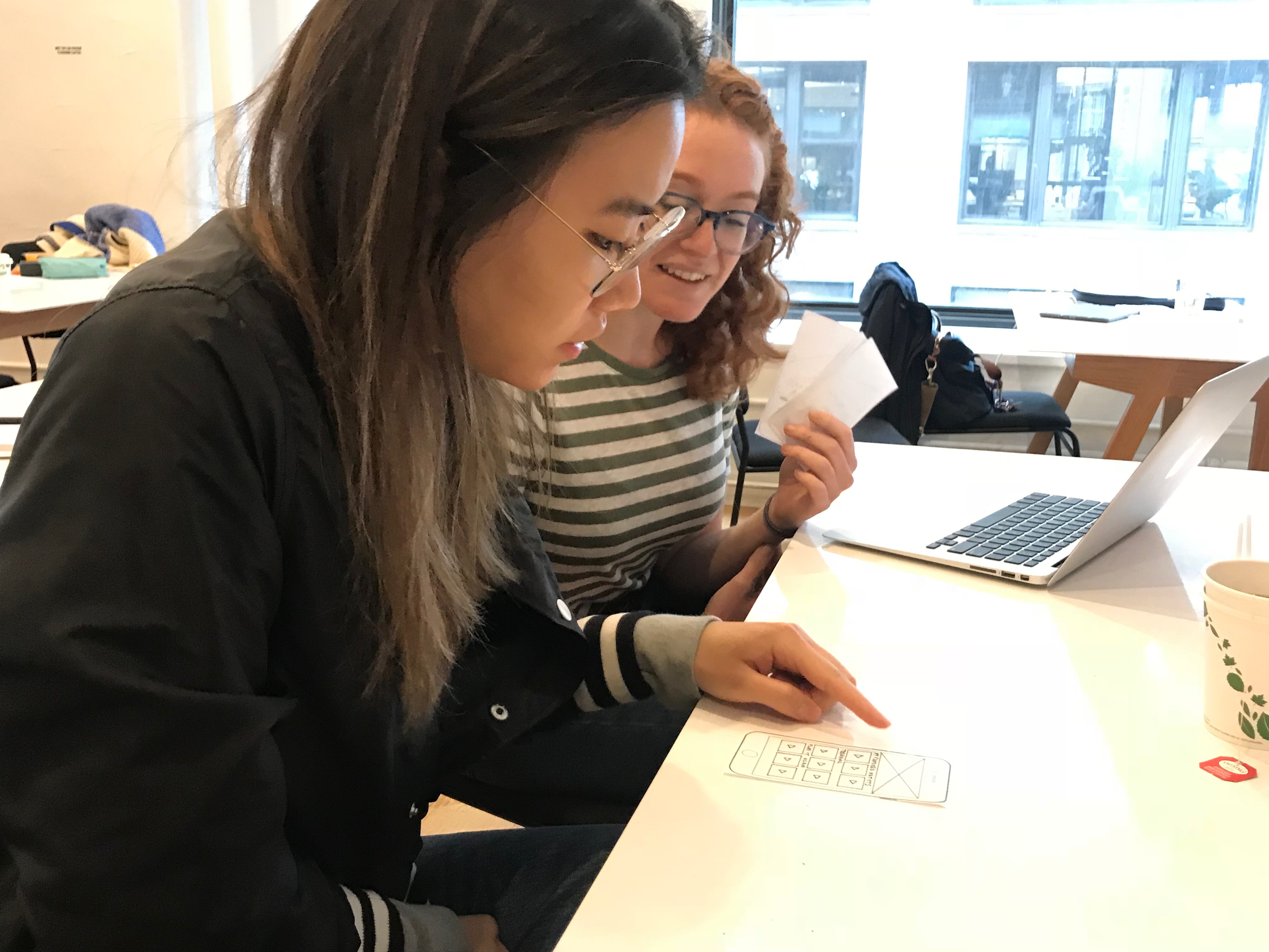
Based on insights from our user research, we hypothesized that if a user likes a song and favorites it, they will feel as though the artist is good enough to merit a tip. We tested our hypothesis with our low-fi wireframes, and continued iterated on our tipping concept, copy and design aesthetic.
METHODS
2 rounds of design studio
Whiteboarding, sketching & feature prioritization
4 usability tests with low-fi wireframes
5 usability tests with mid-fi prototype
2 usability tests with hi-fi prototype
THE RESULTS
INSIGHTS & ITERATIONS
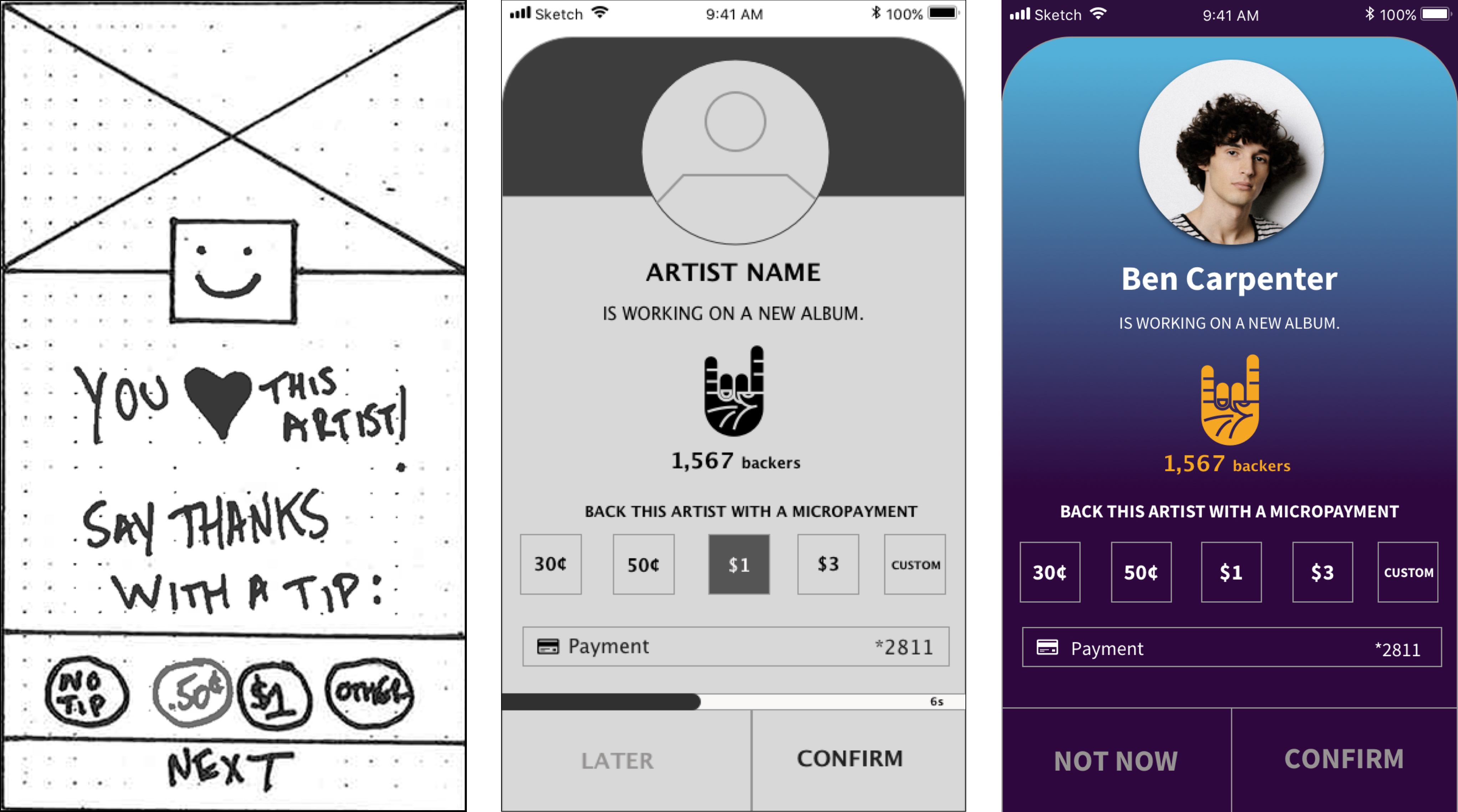
Tipping → “Back this artist”
Though all users could easily complete tasks, 2 of 4 users were turned off by the word “tip,” and they wanted to know where the money was going. Also, users expressed disgust over the idea that they’d see the tip pop-up screen after each song they liked.
Changing the copy on the tip screen to “back this artist” elicited positive feedback during usability testing of our mid-fi and hi-fi wireframes. We also decided to change the tip format: rather than have the pop-up screen triggers by the user liking a song, the pop-up screen would act like Spotify ad because many of our users are familiar with Spotify. After listening to a few songs, a user would see the tip screen and either have to send a tip right away, or wait 30 seconds before s/he can listen to the next song.
Why It Rocks (tipping icon)
Since supporting independent artists is a core value proposition setting PurpleThrone apart from competitors in mobile music streaming, we wanted to highlight that visually using a “rock” icon throughout our designs.
We introduced the “rock” icon when we redesigned PurpleThrone’s onboarding, and our usability testing revealed that the icon was learnable and memorable—many users commented on it as they moved through the app.
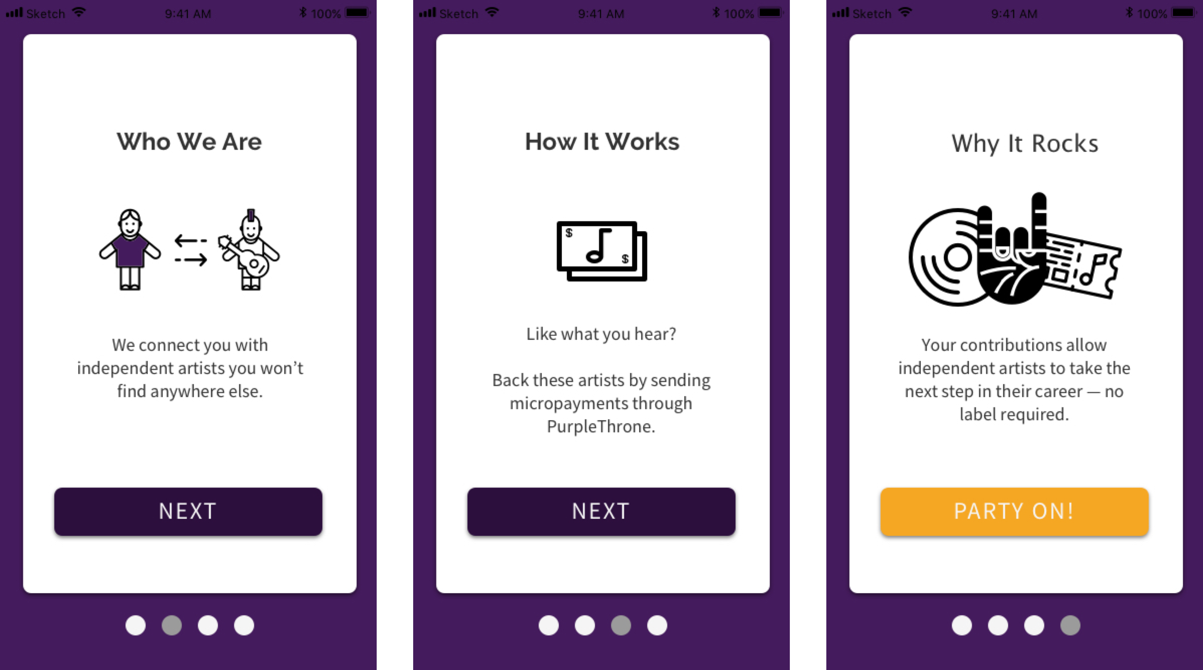
Onboarding & Home Screen
Users had no trouble understanding the onboarding screens we created for our mid-fi usability testing. People loved the lighthearted “Party On” call-to-action button, and they also liked the rocker hand icon. In our mid-fi prototype, we had users select their favorite genres during onboarding and then we designed the homepage to display songs/artists from that genre—users noticed and made positive comments about the personalization.
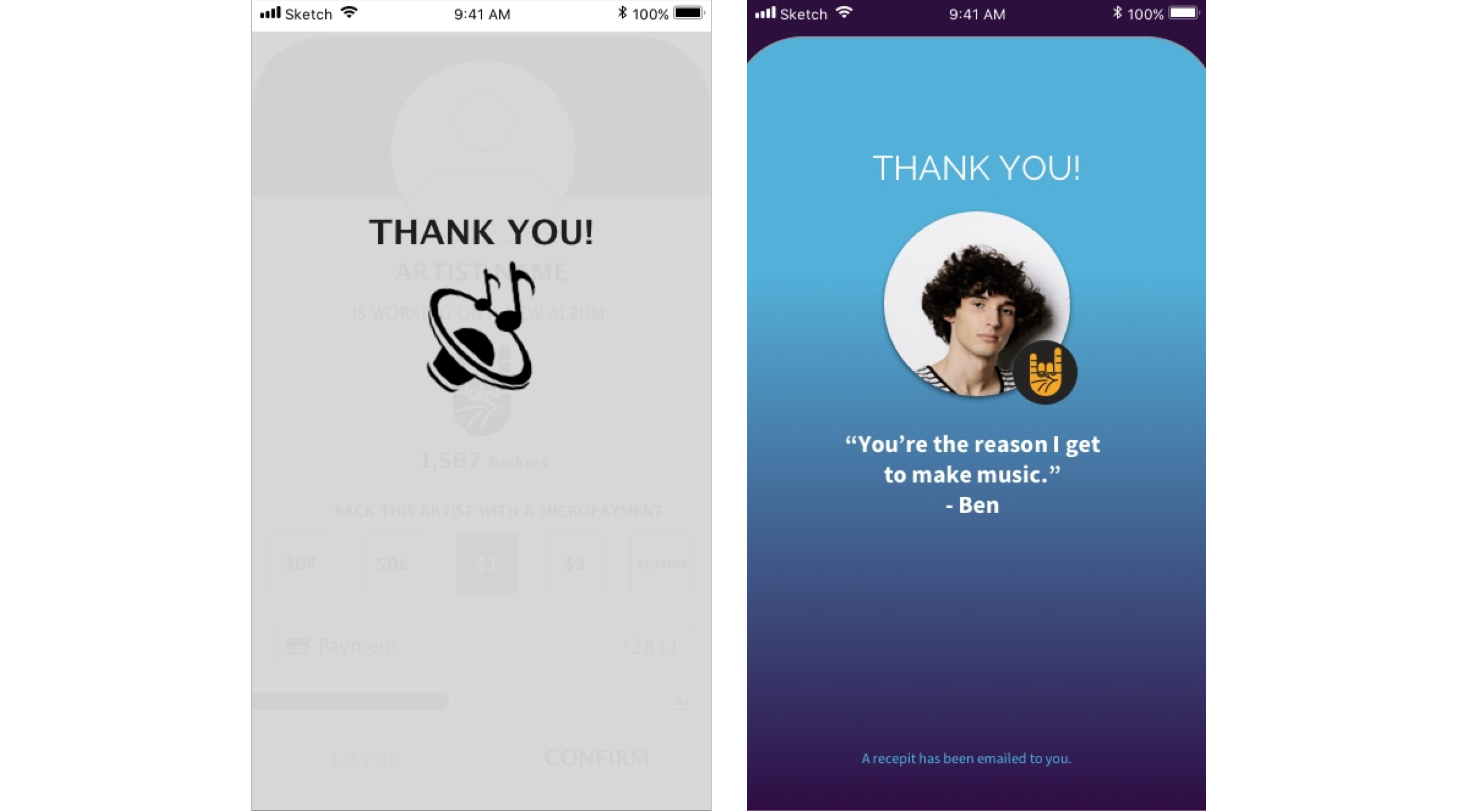
Generic Thank You → Personal Message
For our mid-fidelity wireframes, we created a quick “thank you” screen. Our testing revealed that users liked the screen but wanted a more personal message, and wanted to be notified about getting a receipt. We added a photo of the artist, a “thank you” quote from him/her, and copy telling users that a receipt would be emailed to them.
THE IMPACT
POSITIVE RESULTS AND NEXT STEPS
Presenting our final prototype and mockups to the client went well — our stakeholders respected our design decisions because we thoroughly explained our research and usability testing. They were impressed by our ability to tap into users’ generosity by allowing the app to foster a connection between music fan and artist.
The design sprint served as a proof-of-concept and since then, I’ve gone back and refined the UI of several key screens. Several key changes I made included: increasing button size to align with HIG (Human Interface Guidelines) standards, adding labels to the tab bar, and adding better typographic hierarchy.
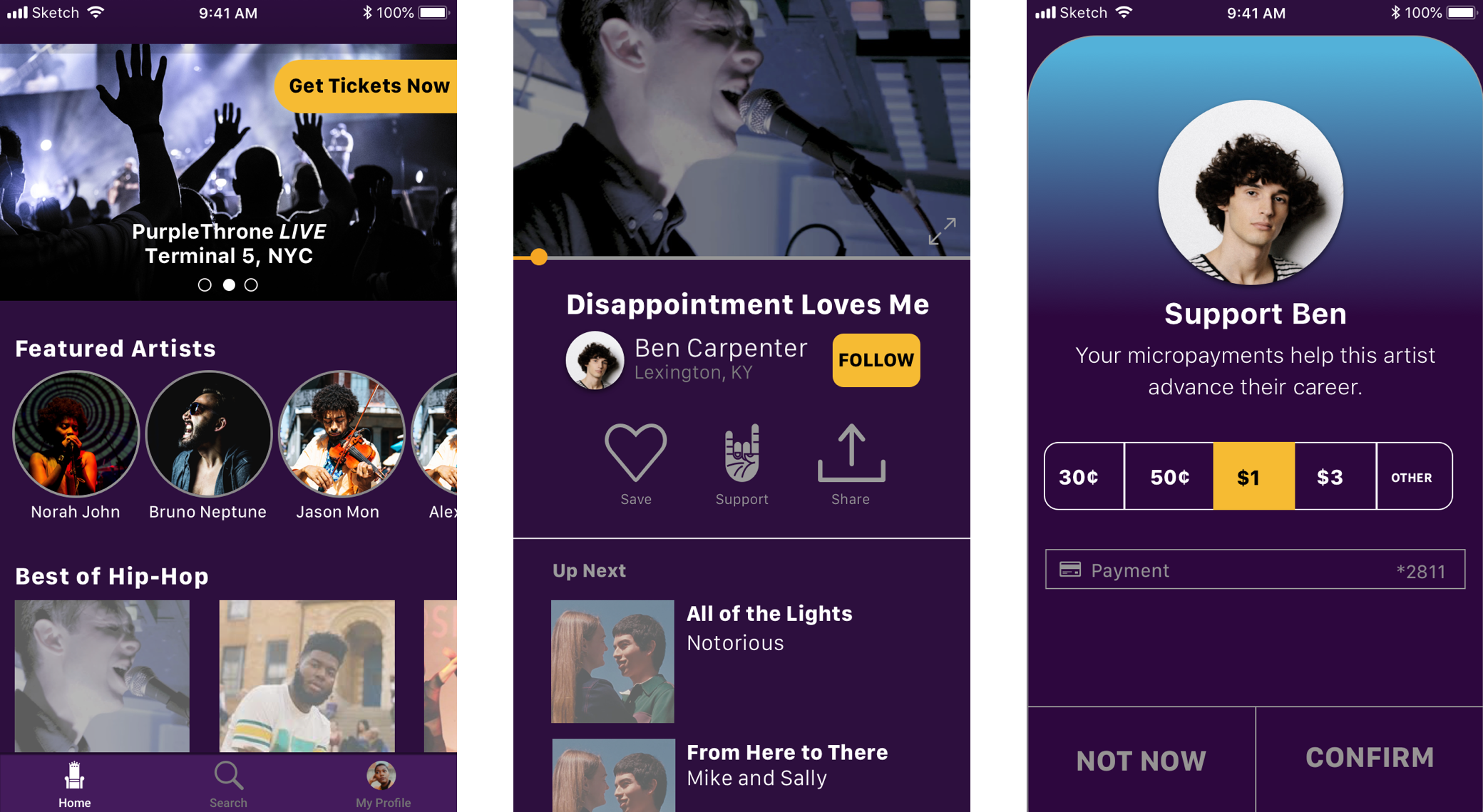
From left to right: Home screen, video viewer, tip screen.
Extending this project beyond the initial design sprint, our team would like to dive into the following:
Additional testing of hi-fi prototype
Cryptocurrency integration
Calendar feature for users to browse live events with PurpleThrone artists
Research, design and testing of separate product for artists to manage their presence on PurpleThrone